Refining the look for Crush Crush Flower with the help of FlipaClip
Another concern I had with my concept image and turning it into the game character is the detail in the drawing. For an action/arcade game, the character will be smaller on screen (max a couple hundred pixels and probably much less). This means the details I have in the drawing may not be legible and just make the character look busy and hard to read.
Playing with how I might animate the character in FlipaClip inspires me to simplify the character design so it reads more clearly and can be scaled down to game screen resolution. It still has the nice sketch look that I’m after.

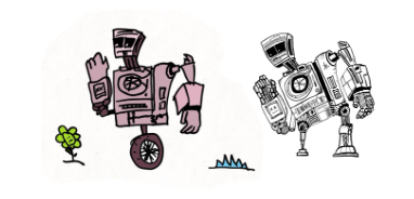
It’s getting more readable but may be too detailed still. This also leads into some color options and thinking about accessibility in terms of contrast.
Leave a comment
Log in with itch.io to leave a comment.